Friday, May 27, 2011

Heritage Layout: Jackson


This photo is of grandfather as a young man.  He was always called Jackson, even though his name was John.

Jackson was a man of two worlds.  He came to Canada from Ireland with his mother, father, and siblings as a young man.  The Graphic 45 papers were the perfect backdrop.  I think the image of the young man on the patterned paper looks very much like my grandfather - they both have that same far-seeing expression on their faces.


My ancestors landed, like so many others, in New York City, and I kept the Statue of Liberty prominent for that reason. If you enlarge the next image, you can see where I've layered an image of an ocean liner to commemorate the voyage:

My grandfather was a quiet and strong guiding presence in my life, right up until my teens.  He worked as stationary engineer in those days, and I can still remember his collection of wrenches, awls, and gauges that used to fascinate me as a child.  That is why the metallic embellishments seemed just right for this layout.

Inner Grunge-Punk
I didn't want the metal pieces shiny and new-looking - I wanted them to have the patina of age.  To accomplish this, I ventured on to the wild side and channeled my inner grunge-punk.  I used distress inks and glimmer mists, and then eventually covered everything with Distress Embossing Powder and a heat gun.  Here is the result:


Jackson was a great heart of a man.  I wanted the heart to look strong and shining, in contrast to the machinery he worked with.  I detail cut the watch images from Bo Bunny Timepieces collection. As you might guess, he always wore a watch in the pocket of his vest.

In the layering of papers and elements, some things got covered up, despite my original intention. What's hidden is where it says "Perfect Gentleman"; Jackson's photo is resting right above those words.  An accidental yet perfect placement.

We have had tons of rain here lately = lots of scrapping getting done!
Thanks for stopping by.  If you have a moment, please leave a note -  I love reading  your sweet comments.


Materials List:
Graphic 45 papers  (Perfect Gentlemen) 
Tim Holtz Ideology gears; watch face
Dusty Attic layered chipboard frame
Bolts and hexnuts from my husband's tool box!
Metal letters from Michael's
Tattered Angels Glimmer Mists (Dragonfly; Decadence)
Distress Embossing Powder (Old Paper)

Tuesday, May 24, 2011

On With the Dance


This is my daughter with her boyfriend at her glorious birthday party.  I created this layout as a gift for her, to hold on to the memories of a wonderful evening.

I've called it "A la Danse", since dancing was a big feature.  I'm told the young people DID dance all night, or until the party room was closed.  (I must take their word for it;  I turned into a pumpkin at 12 pm.)
For this layout, I was inspired by the Parisian theme and vibrant colours of the Backstage collection by Prima.


I did some water distressing along the top and side to create a pulled-back curtain effect.  After some inking with Dusty Concord Distress Ink, I attached an amber faceted charm to a tiny ruffle made from tulle,  tucked in behind the "curtain, like a tie-back.

The die-cut frame is from Dusty Attic.  I inked it and misted it 4 or 5 different shades of blue and beige; then topped it off with Vintage Paper Distress Embossing Powder.  It was an experimental procedure (!) and I am happy with how it turned out.


The birdcage was stamped on white cardstock with Weathered Wood, trimmed, and adhered it to the lovely scroll-y cardstock piece (also from Prima).  I slipped it under the frame and added a heart locket and key.
The floral frame is a combination of my own hand-made paper flowers and gorgeous big blooms from Prima.  The leaves I found at Michael's just by chance one day - I adore their colour and the lustre.
I used a Prima pebble to make the centre of the flower at the top.  If you look closely, you can see the Folies Bergere dancer and her headdress inside the little globe.
                    
I finished the floral frame with another chipboard sticker and a tiny Eiffel Tower, in keeping with the Parisian theme.

The laser-cut flourish is from Dusty Attic.  I covered it with acrylic paints in Pesto and Cape Cod Blue.
It was a night to remember, filled with fun and a perfect way to celebrate "the age of which we do not speak". 


On with the dance! let joy be unconfined;
No sleep till morn, when Youth and Pleasure meet
To chase the glowing hours with flying feet.
~George Gordon, Lord Byron, 
Childe Harold's Pilgrimage

Happy Birthday, Leigh-Ann!


Materials List:
Prima Backstage Collection (Juliette, Celeste)
Prima glittered Cardstock Stickers
Prima Clear Stamps
Pebbles (Prima)
Flowers: Prima (Ariel)
Leaves: Prima. Temple Collection
Bling: Kaiser Craft
Letters:  7 Gypsies (Venice)
Chipboard Frame & Flourish: Dusty Attic
Metal Charm & Adornment: Tim Holtz, Idea-ology

Friday, May 20, 2011

Tea With the Fairies

Waltzing Mouse Stamps is celebrating its 2nd birthday with a tea party.  It's open to everyone, and you only need to bring a teacup, or a tea bag, or a slice of cake to join.  (Details are HERE.  Not much time left, I have left this right to the last minute.)

Since no tea party would be complete without a visit from the Fairies, I am bringing Fairy Tea to the party!


Although I did not do much tea-drinking while I was in Ireland (very committed to my coffee), I would definitely enjoy having a cup for this occasion.

I chose a chamomile tea bag, and slipped it into a small envelope from Recollections. I used a BoBunny cardstock sticker (Gabrielle collection) for the tea tag.


 Butterflies and circle border were cut on a Cricut (Elegant Edges cartridge).


The template for the tea caddy is downloadable from the Waltzing Mouse site (click on Freebies).

Materials list:
Graphic 45 papers, Once Upon a Springtime collection
EK border punch
Pearl Pen, cream
Tim Holtz Distress Ink (Shabby Shutters)


Tuesday, May 10, 2011

Treasure On The Beach


“The Sea, once it casts its spell, holds one in its net of wonder forever.”
--Jacques Cousteau 


At this magical moment, my daughter was delighted at finding two large white seashells on a Florida beach, and she was running to her father with her treasures.  Now she is about to be a mother herself,  so some time has passed since the photo was taken - but I chose this photo because there is just something so timeless about the beach.  There is also a beautiful timeless element in the sheer joy on a child's face when they discover something new and wonderful in the world.

On the left side of this l/o, you can see my newest obsession: Dusty Attic laser-cut chipboard embellishments!  This one is a Garden Fairy:


I took a few dabs of white paint and altered the Garden Fairy into a sun-and-wind-weathered Beach Fairy, looking down upon my daughter when she was 2.

I also added a few DA mini-flourishes in the corners of the l/o:


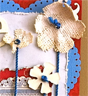
Flowers were cut from cardstock and burlap using Tattered Flowers Alterations die.

 
Then I added a little Stickles, a little white paint, and a lot of paper -distressing to give everything a more weathered look.

I am working on my next vintage/heritage layout - hope to have it up later this week!

“The beach is in our blood. Everyone in our family returns to the beach instinctively, just like the sea turtles.”

--Sandy Archibald


For other beach people like me, or anyone who just craves some beach therapy, there's "A Gift From The Sea" by Anne Morrow Lindbergh. (You can read excerpts here) This little book is filled with  bits of timeless beach wisdom and reflections on being a busy wife and mother in mid-20th century America. The book was wriiten on Captiva Island in Florida.  (And that's where the photo of my daughter was taken.)

Thanks so much for stopping by today.

Sunday, May 1, 2011

Hello and a Surprise


Here is my entry for the Let's Get Shabby contest #23.

The photograph is my sister when she was 3 years old.  This layout is the fourth in a series of vintage family layouts I am working on in 2011.  (Since the picture was taken back in the 50's, I guess we have to call it vintage!)

The layout started out to be a more traditional heritage style, but something strange happened while I was working.  After I distressed and Glimmmer - misted the background paper, the little girl in the picture just called out for a more colourful and free-form style.  Honestly, I had no idea what I was doing - the elements virtually selected themselves.  I found myself adding butterflies, bright flowers, and metal design elements.

It really isn't my usual style at all.  I don't know what kind of style this layout is.  Little bit vintage, little bit shabby, little bit steampunk?

More Surpises in Creation Process
I put it all together and took it apart many times.  Once I was finished, I hated it.   So I left it alone in my scrap room for a day or two.  When I looked at it again, I loved it - surprise!

And I didn't intend to enter a contest, either.  By chance, the first website I visited after  I loved the layout was Let's Get Shabby, and the aqua and rose colours are the main basis of this particular challenge.    It just would seem wrong NOT to enter now that everything has lined up like this.

This was a lesson in "you just never know".  The creative life does makes for some really interesting experiences!  I will keep you posted if anything else happens.
Thanks for stopping by.

Fran

materials list:
Bo Bunny papers (Timepiece)
Dusty Attic chipboard butterfly
Tim Holtz Ideology metal elements
Bo Bunny (Gabrielle) stick-on lettering
Tattered Angels Chalkboard Glimmer Mist (Chocolate)
Ranger Distress Inks